Omni Hotels & Resorts | New Concept Menus
A push by Omni to open two new high-level themed resorts with several concepts under one roof also found them wanting menus that were as attention-getting as the dining opportunities they represented. I ended up being responsible for four of these concepts: a collaboration with Top Golf, an outdoor icehouse-style barbecue, a library themed eatery, and a rooftop lounge that offered stunning views of the evening sky.
—
Design Ideation

Lucero Rooftop Lounge
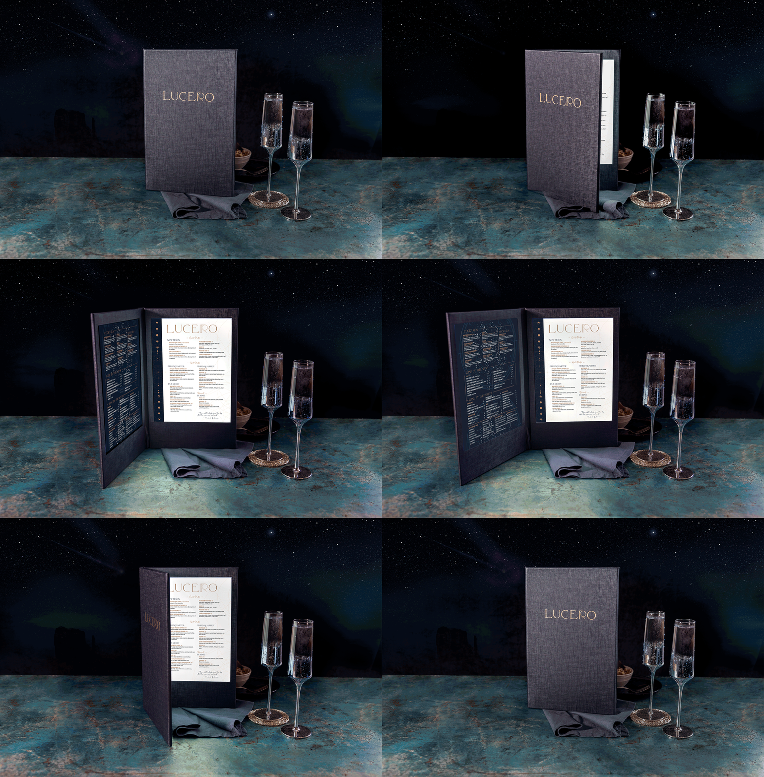
Food offerings are printed on the “light” side of the menu while beverages and cocktails are printed on the “dark.” Both nestle within a menu vehicle that works as a rechargable lightboard. The light side casts a subtle moonbeam glow when opened, and ink-free pinpricks between the listings on the dark side illuminate, giving the impression of a night sky full of stars.
Menu sections and cocktails are titled to pair with lunar phases and other astronomical terms, connecting the diners’ experience with the rooftop venue.


Library Rules
Catering to “seekers of the curious,” this coffee and wine space brings in elements of science and literature. Shelves of tombs nestle beside chalkboard walls and urban textures. The menu for this concept needed to reflect the tactile and eclectic nature of the space while embracing its more playful elements. A smaller countertop version would be available during daytime coffee service as well.


Ice House
An outdoor venue with a penchant for saucy fingers, this menu was envisioned printed on thin, recyclable paper to double as a disposable placemat once diners had received their fare.
Omni opted instead to mimic the look, but print on a synthetic substrate that could be wiped down between customers.


Top Golf
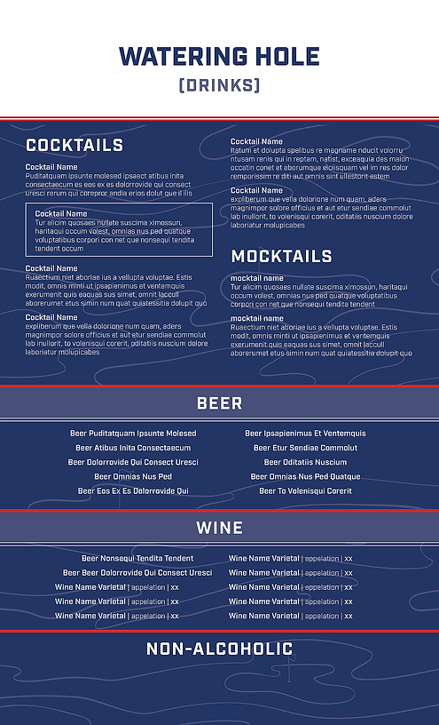
In partnership with Top Golf, the key to this concept was keeping in line with the clean lines and colors specified in the Top Golf brand. A little visual interest was brought in (as well as some menu segmentation) by reversing the color blocking from one side of the menu to the other.

